TRADE 24/7
Deliverables
TRADE 24/7
Year
2024 – ONGOING
Industry
FINTECH / ONLINE TRADING
Scope of Work
WEB DESIGN
PRODUCT DESIGN
NO-CODE DEVELOPMENT
MOTION DESIGN
Project Overview
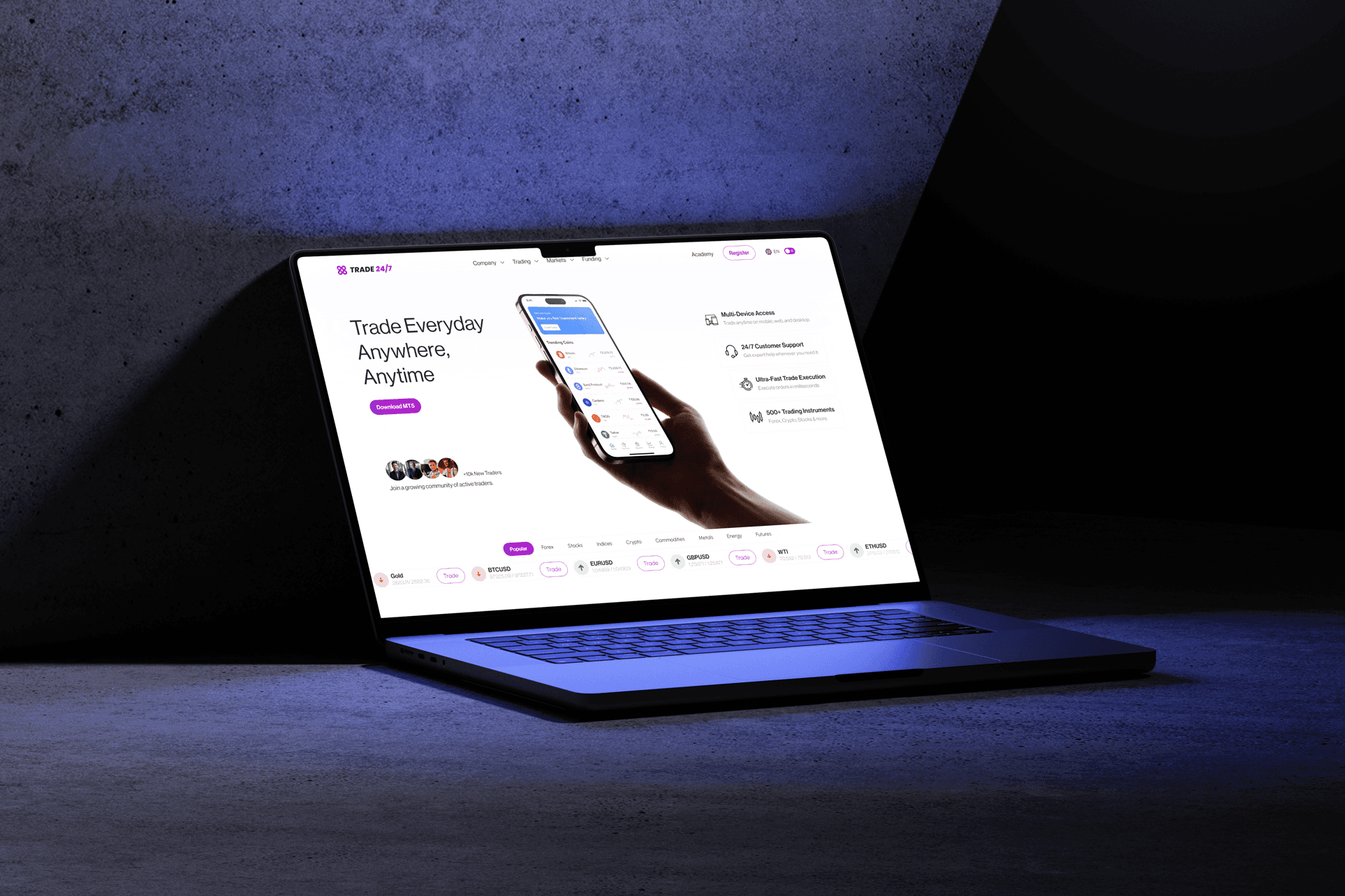
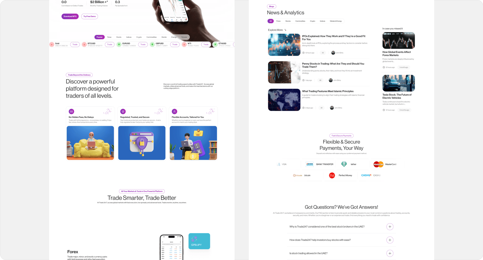
Trade 24/7 was designed to make online trading simple, fast, and reliable for both beginners and experienced traders. My goal was to build a platform that gives users instant access to global markets with clear interfaces, real-time data, and frictionless trading actions.
My Role Section
Trade 24/7 was designed to make online trading simple, fast, and reliable for both beginners and experienced traders. My goal was to build a platform that gives users instant access to global markets with clear interfaces, real-time data, and frictionless trading actions.

I interviewed beginner traders who needed clarity, and experienced traders who demanded speed, accuracy, and advanced tools. This helped me identify what mattered most across experience levels.
I mapped out layouts for charts, watchlists, portfolios, and trade execution flows. I created interactive prototypes that simulated real trading scenarios.
User feedback uncovered confusing navigation paths and unclear data hierarchy. I refined the interface multiple times, simplifying steps and improving chart readability.
I worked closely with engineers to ensure the design translated accurately to code, especially with live data, market refresh rates, and responsive layouts.
The Problem
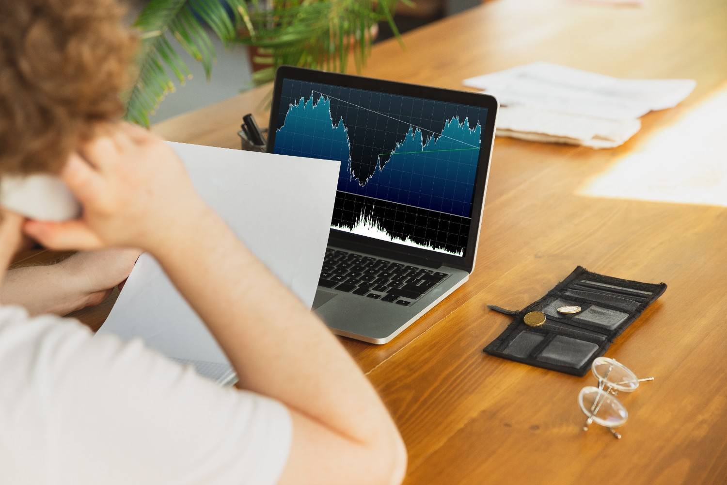
Most trading tools are not designed with clarity in mind. Beginners often feel lost because everything looks complex. Experienced traders face slow execution flows, hard-to-read chart interfaces, and cluttered layouts. The challenge was to deliver a smooth system that reduces cognitive load without removing the features advanced users rely on.
The Solution
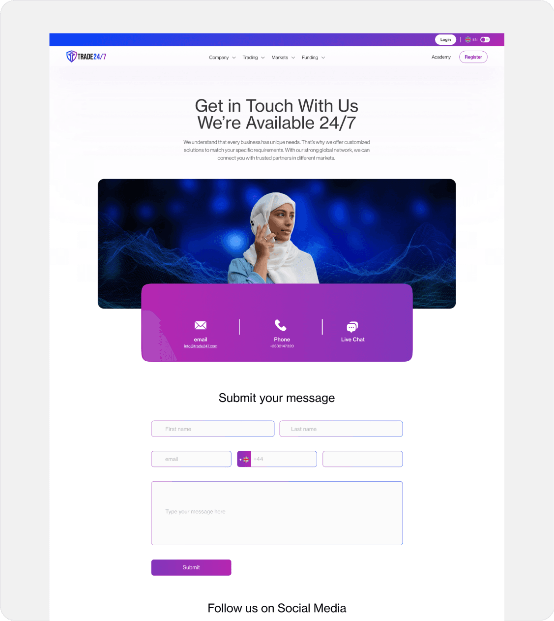
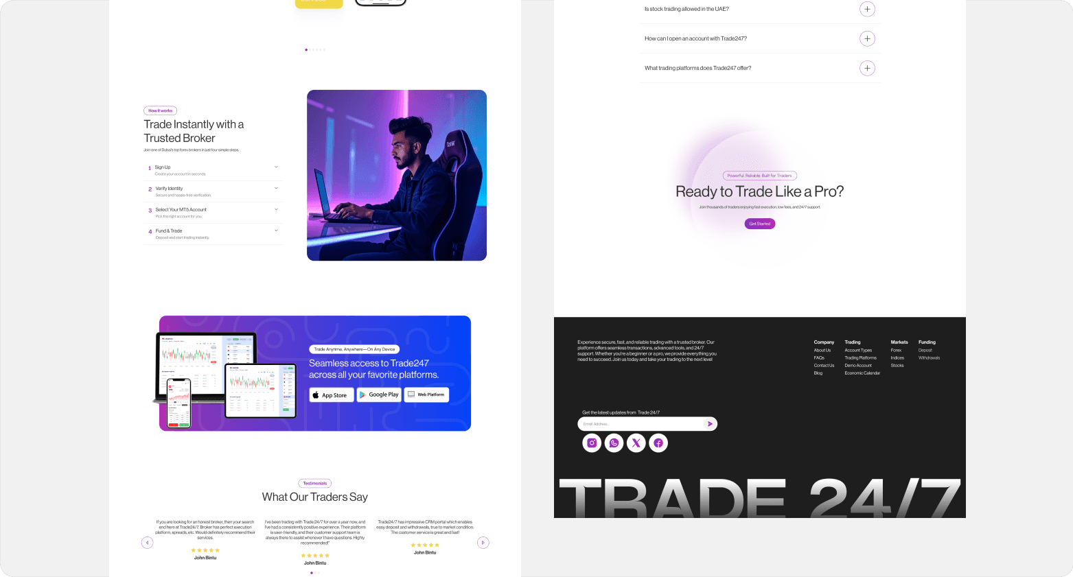
I designed Trade 24/7 to feel clean and structured, with focused workflows that help users act quickly and confidently.
Every decision came from user feedback — from how charts were displayed to how trades were executed.
I used strong visual hierarchy, clean spacing, and structured layouts to make data easy to absorb.
The system updates live market info instantly, showing price changes, notifications, and confirmed trade actions.
Design Process
1
User Research
I interviewed a mix of beginner and experienced traders. Beginners needed fewer distractions and simple explanations. Professionals wanted speed, customizable layouts, and reliable order execution. These insights helped me design a system flexible enough for everyone.

2
Wireframing & Prototyping
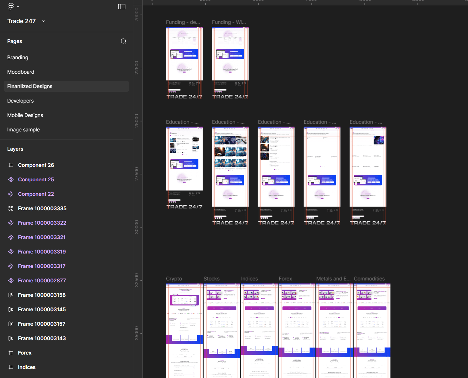
I began by sketching wireframes to structure the core trading experience, exploring different layouts for charts, watchlists, portfolios, and order panels. Once the general flow felt natural, I transformed these wireframes into interactive Figma prototypes. This allowed me to simulate real trading scenarios—switching markets, opening charts, placing trades—to evaluate information hierarchy, loading behavior, and overall usability. The combined wireframing-to-prototyping workflow helped me validate ideas quickly and refine the interface before moving into high-fidelity design
3
User Testing
I tested the interface with both beginners and pros. Beginners struggled with chart complexity, so I added a simplified chart mode. Advanced users needed faster access to order types, so I built a quick-trade panel. Each round of testing helped improve clarity and speed.
4
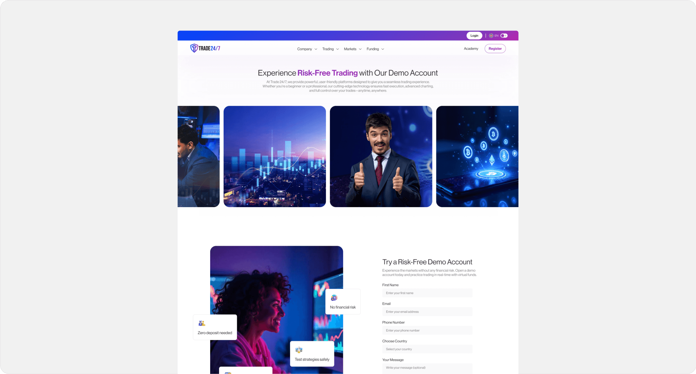
Final Design
I refined the visual system, improved spacing, simplified the order panel, and optimized the chart layout. The final design delivers an intuitive, fast, and structured trading experience with a strong focus on clarity.
Challenges
I faced several challenges during the project:
1
Simplifying complex processes: Trading involves technical tools, multiple order types, and volatile data. The challenge was simplifying without removing essential features.
2
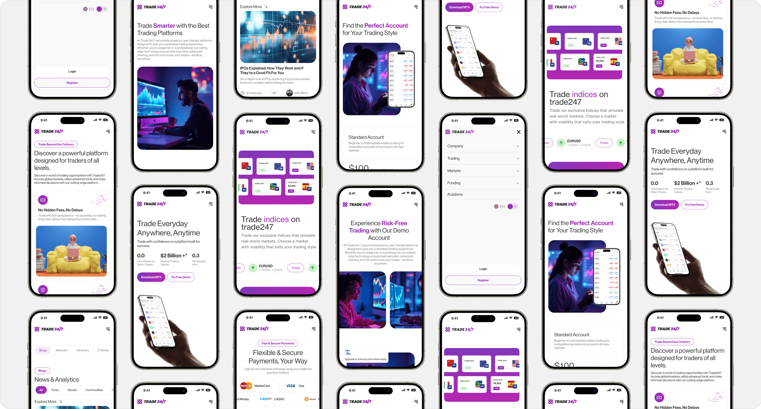
Ensuring responsiveness across devices: The chart and trade layout had to adjust perfectly across mobile and desktop, which required careful grid planning.
What I Learned
This project taught me valuable lessons that I’ll apply in future designs.
User feedback is crucial: Real traders exposed issues I wouldn’t have discovered alone.
Iterative design is key: Small iterative improvements made the platform cleaner and easier to use.
Balancing simplicity with functionality: I learned how to prioritize clarity without sacrificing the power that advanced users expect.

Impact
The platform’s launch resulted in positive feedback and measurable success.
User Satisfaction: Traders said the platform felt clearer and more approachable.
Efficiency: Users were able to place trades faster and find market data with fewer clicks.
Engagement: Simplified charts and fast navigation helped users stay active on the platform longer.
Conclusion
This project reinforced the importance of clarity and user-centered thinking. By focusing on simplicity, speed, and accessible interfaces, I created a platform that makes trading feel less intimidating while offering the features experienced traders expect.