XO Bar Menu Design
Deliverables
Food Menu Design
Year
2023
Scope of Work
FLYER DESIGN
PHOTOSHOP
GRAPHIC DESIGN
BRAND IDENTITY
Project Overview
The XO Bar menu was designed to improve how customers browse, choose, and engage with the restaurant’s offerings. Many existing menus suffer from clutter, poor readability, and weak visual hierarchy. My goal was to create a clean, appetizing menu that guides customers smoothly through a diverse selection and enhances the overall dining experience.
My Role
As the solo designer, I handled the entire visual strategy and layout development.

Defining the visual direction
Structuring the menu layout for readability
Selecting colors, typography, and brand texture
Enhancing imagery for appetite appeal
The Problem
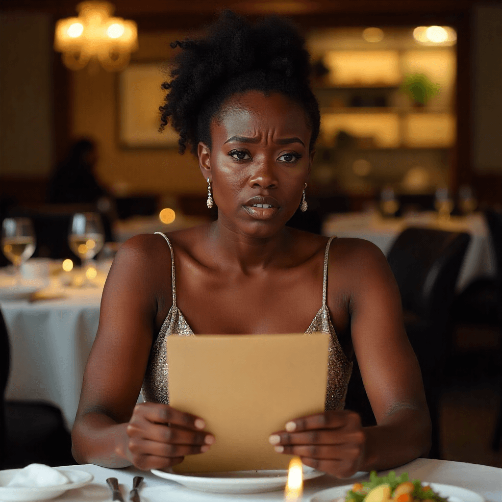
Customers often struggled to make quick decisions because the previous menu lacked structure, visual hierarchy, and appetite-driven design. Items were hard to scan, pricing felt inconsistent, and the overall layout did not guide the customer’s eye. The restaurant needed a menu that looked modern, reflected its brand identity, and helped customers choose confidently without feeling overwhelmed.
Design Goals
I focused on building a menu that balances beauty with function, helping customers make confident choices without feeling overwhelmed.
High readability
Clear categorization
A look and feel that reflects the restaurant’s identity
Design Strategy
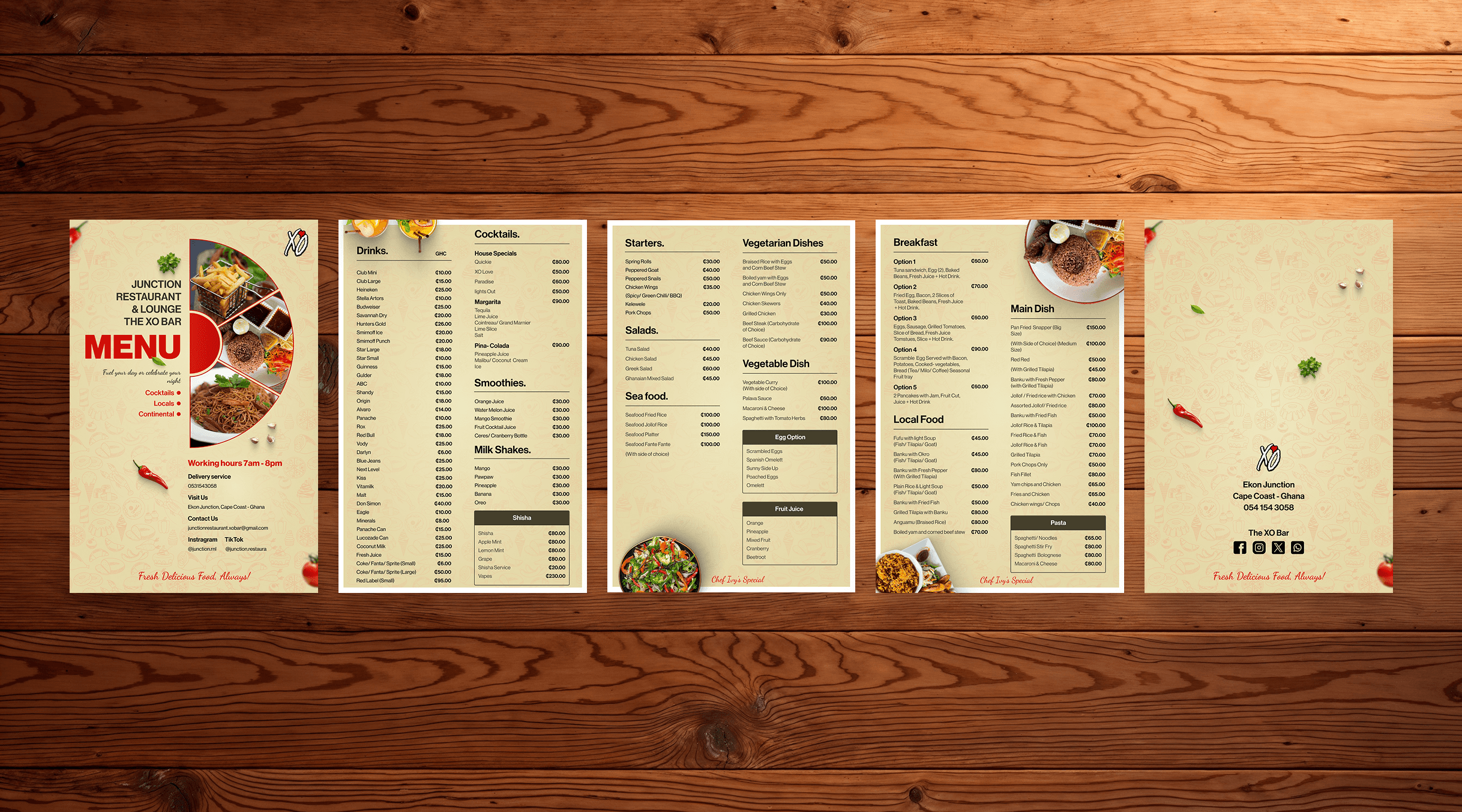
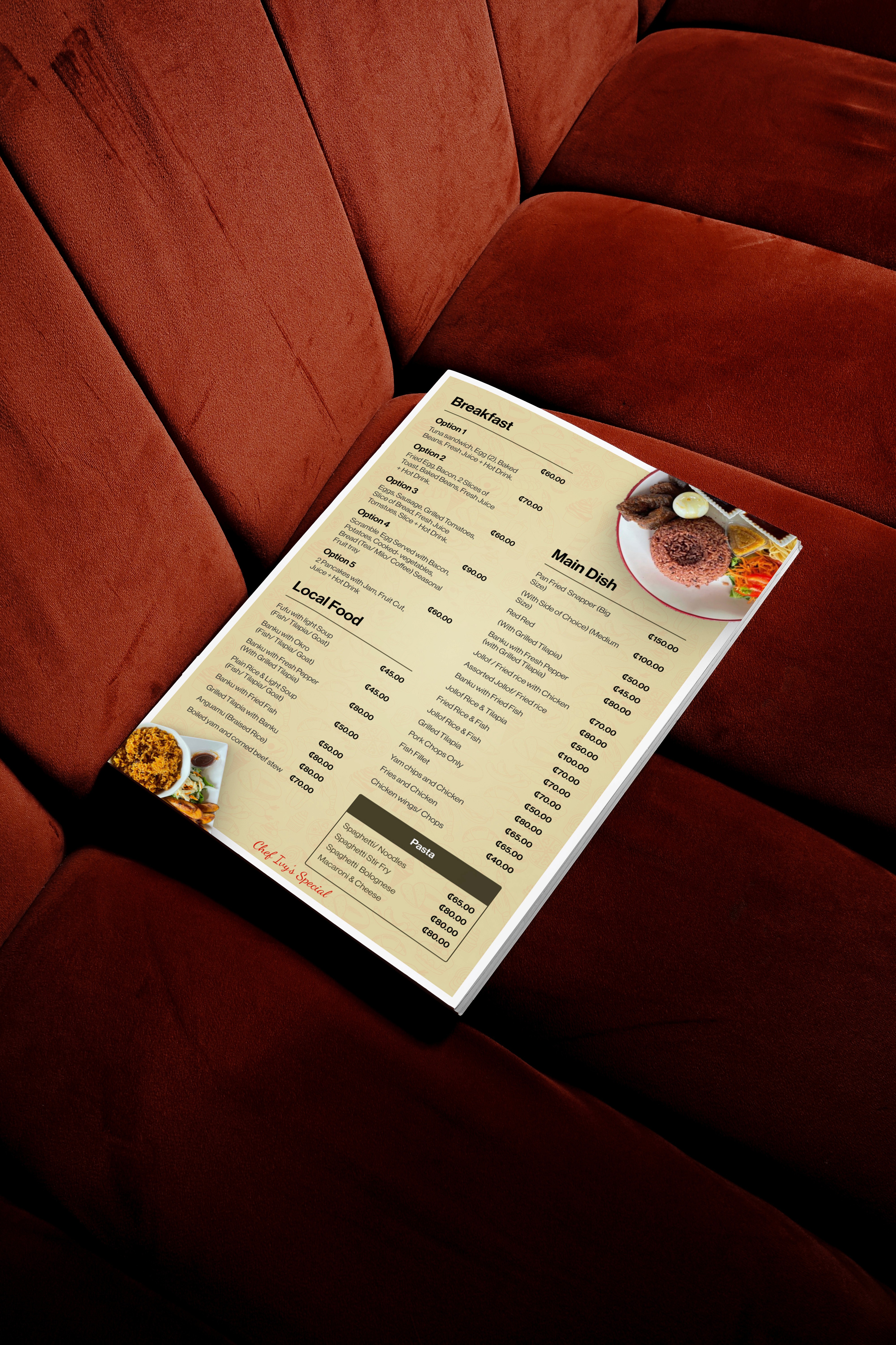
I used a multi-panel layout to segment categories and reduce decision fatigue. Warm color tones like red and gold support appetite stimulation, while subtle branded textures reinforce identity. High-quality food photography highlights signature dishes and draws attention to featured items. The final structure supports natural eye movement across sections, helping customers browse faster and enjoy the experience.
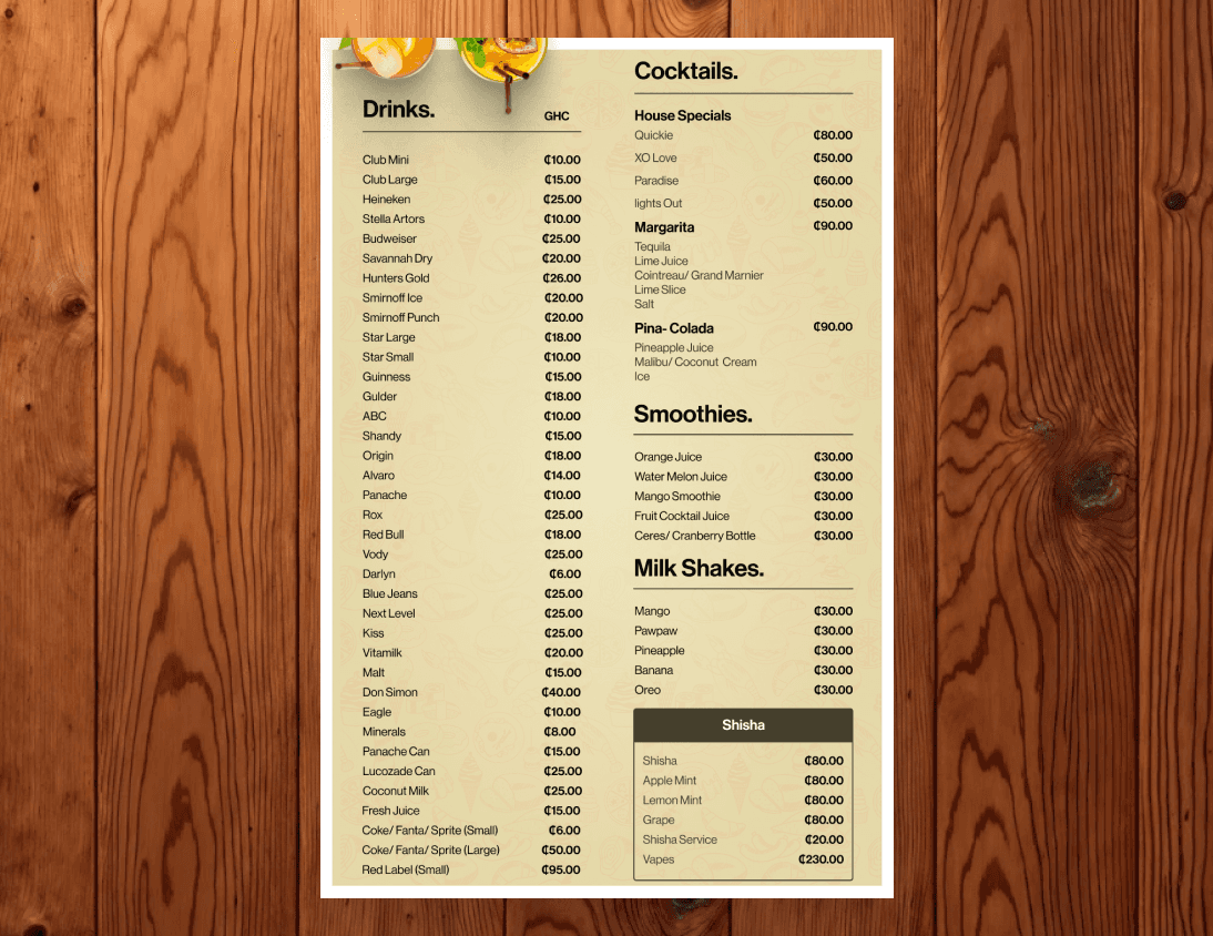
Final Design
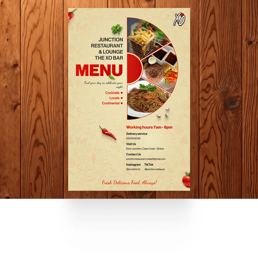
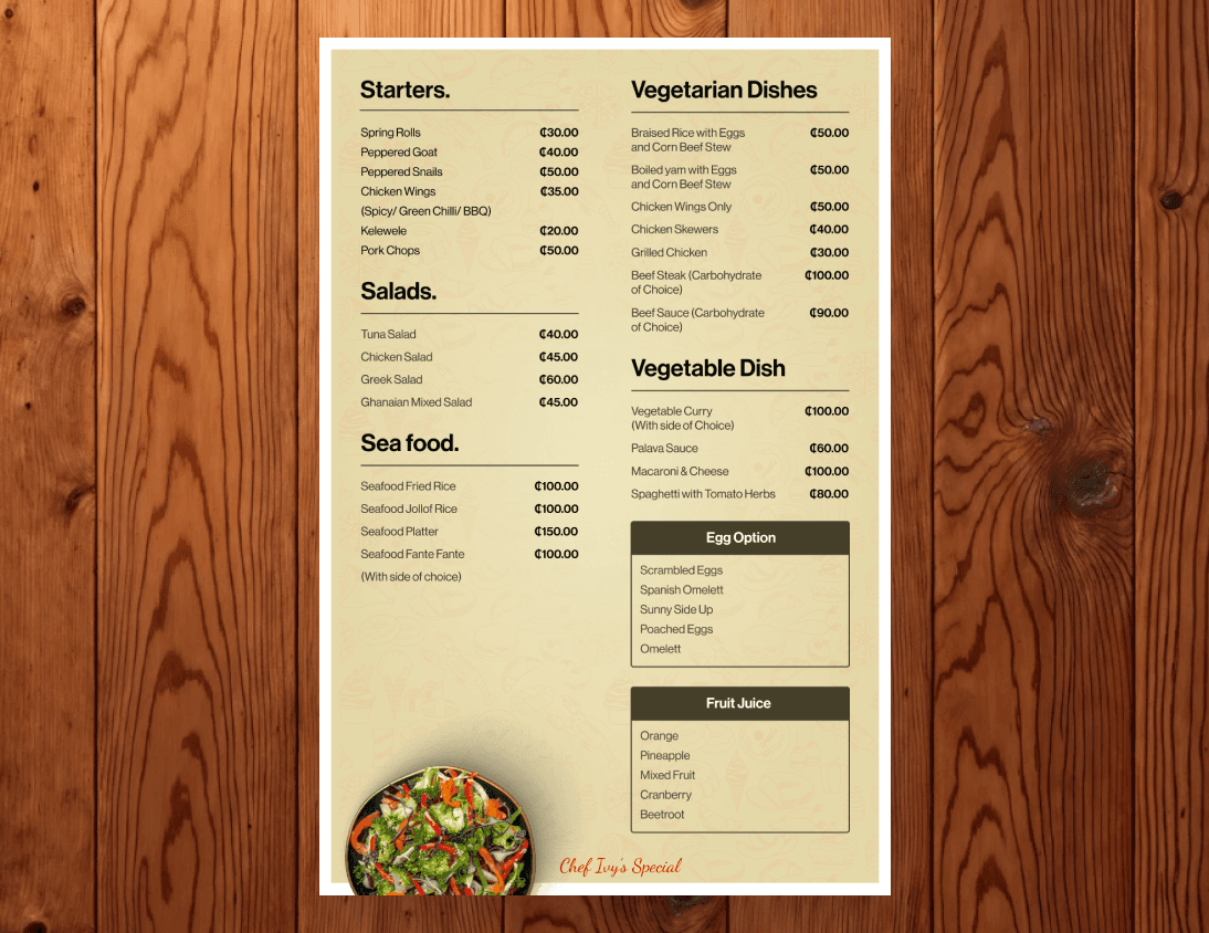
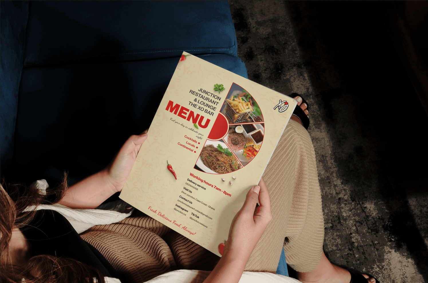
The final menu presents a polished, cohesive, and welcoming look. Items are easy to find, prices are clear, and the visual hierarchy naturally guides customers from starters to mains and specials. The combination of color psychology, clean spacing, and strong imagery creates both clarity and appetite appeal.
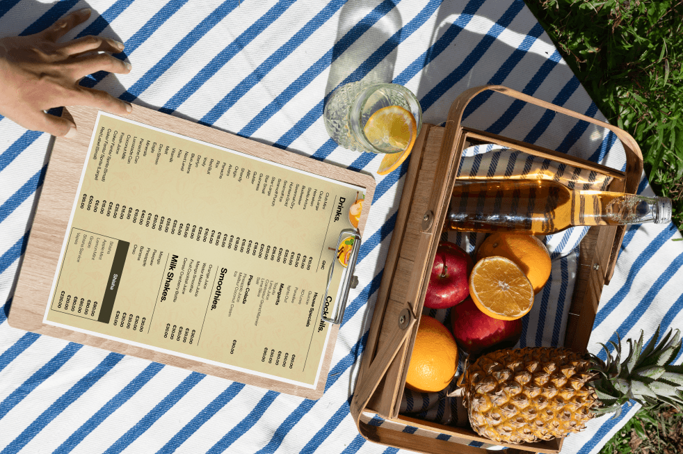
Challenges
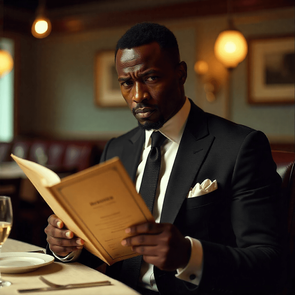
I encountered several challenges while designing the XO Bar menu, each one shaping how the final layout came together.
Balancing visuals with readability
Organizing diverse food categories
Maintaining brand consistency
Impact
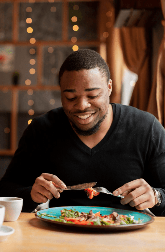
The improved structure and visuals elevated the restaurant’s brand presence and created a more enjoyable ordering experience.
Faster ordering due to clearer layout
Stronger customer engagement with featured items
Improved brand consistency across dining materials