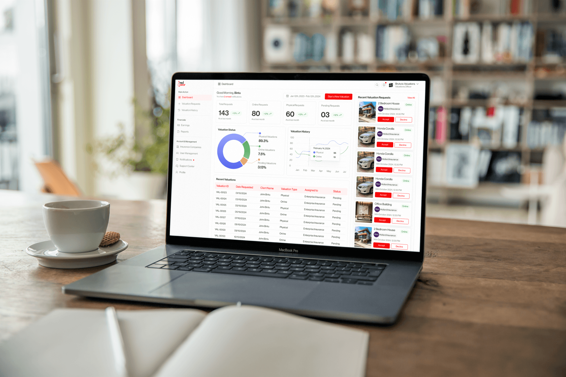
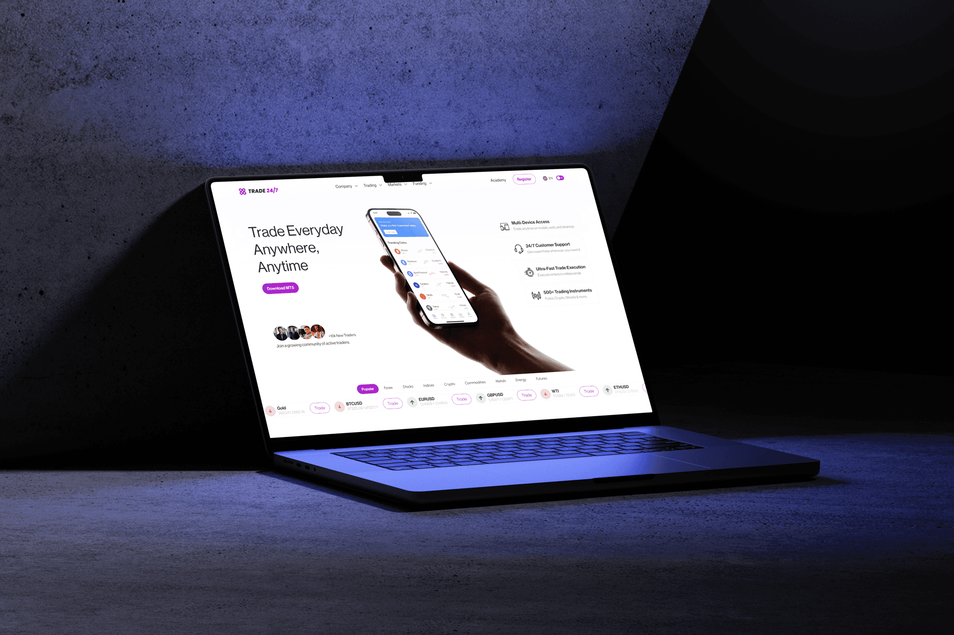
MEL Trade Fair Promotional Poster Design
Deliverables
Students Trade fair Promotional Flyer Design
Year
2024
Scope of Work
FLYER DESIGN
PHOTOSHOP
GRAPHIC DESIGN
BRAND IDENTITY
Project Overview
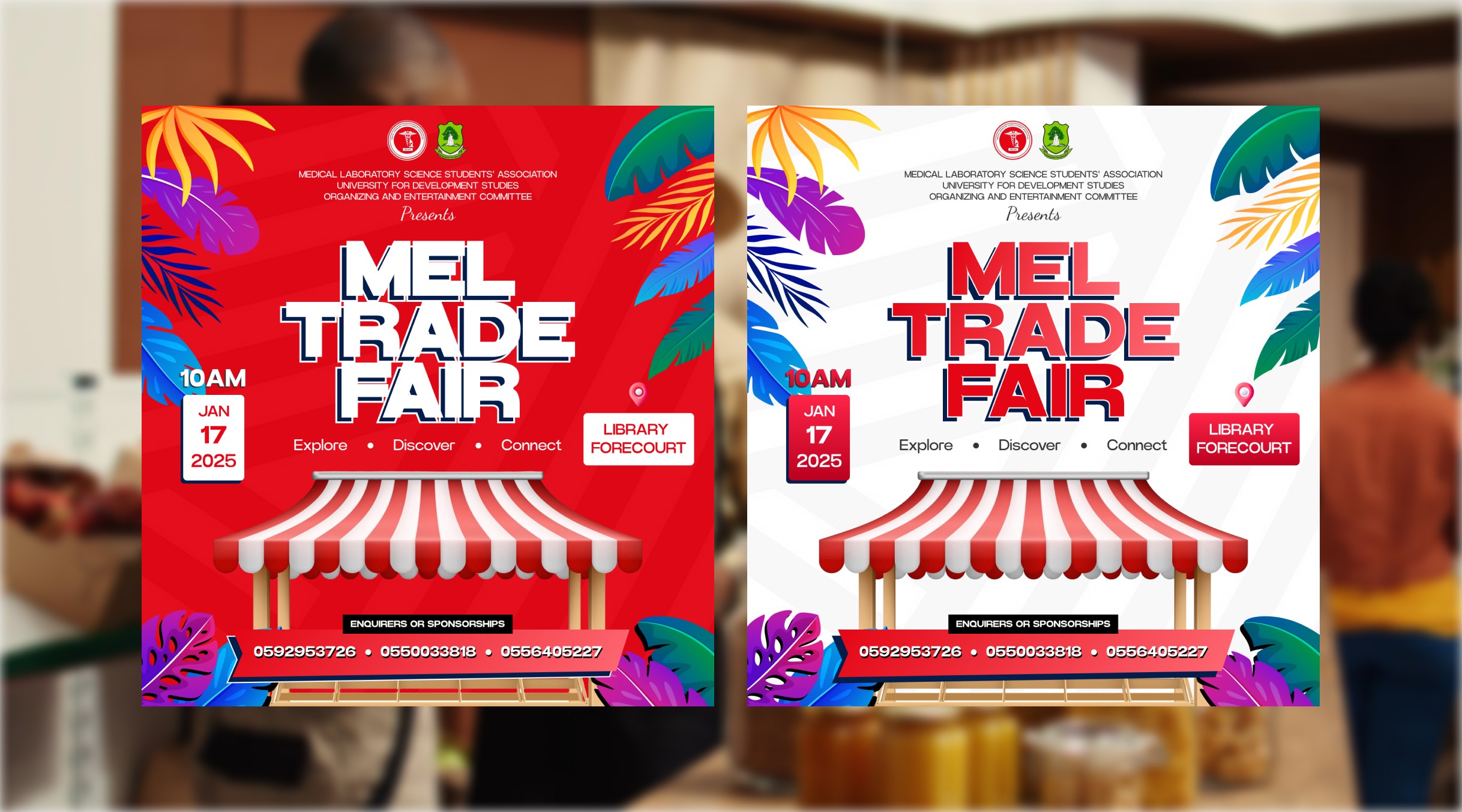
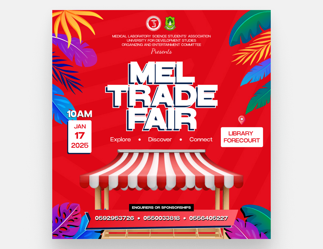
The MEL Trade Fair poster was designed for the Medical Laboratory Science Students' Association. The event required clear, concise communication of the date, time, and location to a student body. My goal was to create an attractive, professional asset that balances essential logistical information with an engaging visual theme, encouraging participation from students and vendors.
My Role
As the designer, I handled concept ideation, layout structure, and the visual exploration of two distinct color palettes.

Defining the central visual motif (the marketplace stall).
Establishing clear information hierarchy (Date, Time, Location).
Developing two colorways for audience testing (Red vs. White).
Selecting playful, yet legible, typography.


The Problem
Previous student event posters often suffered from inconsistent branding and cluttered layouts. The core problem was designing an official-looking poster that still felt welcoming and engaging for a student-run event. I needed to ensure key logistical details were impossible to miss, despite the presence of required organizational logos and contact numbers.
Design Goals
My focus was on creating a poster that is instantly recognizable, easy to read, and promotes connection among attendees.
High legibility for all text blocks.
Establishing a clear visual hierarchy (What, When, Where).
Promoting the core actions: Explore, Discover, Connect.

Design Strategy
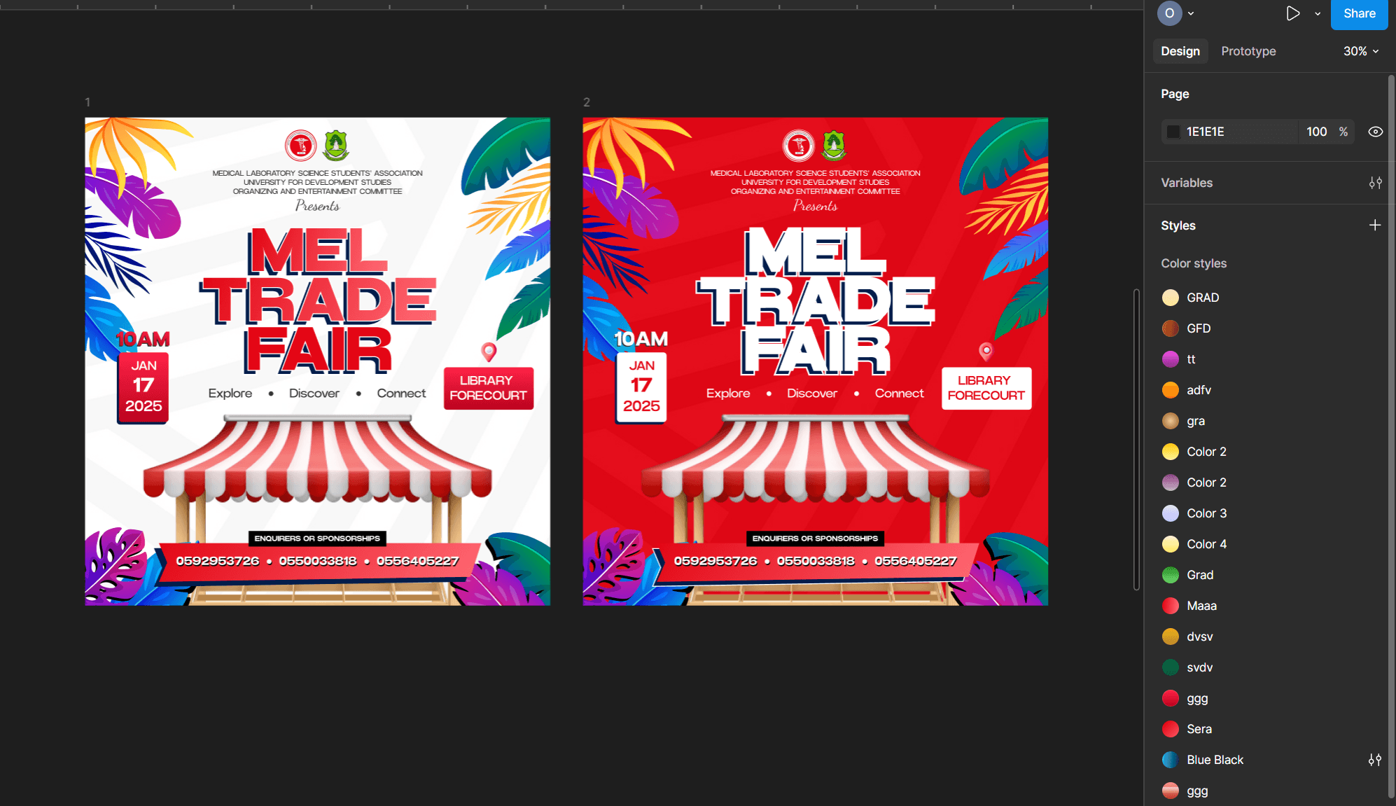
I used the red and white marketplace stall illustration as the central, anchoring motif. This immediately communicates 'Trade Fair.' The tropical foliage frame provides visual excitement and aligns with the event's location in Ghana. The two color versions (white and red) were created to test which better captured the desired mood—the white for a clean, academic feel, and the red for energy and excitement. The key action words Explore, Discover, Connect guide the user's intent.
Final Design
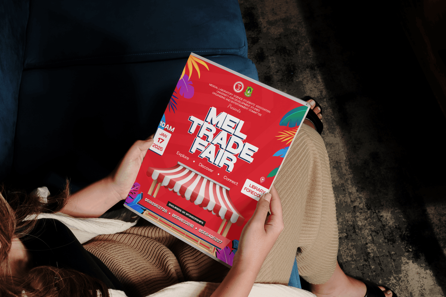
The final design presents a structured yet vibrant poster. The core information is block-formatted for quick assimilation. The marketplace visual is friendly and inviting. The choice between the two colorways allowed the client to select the final mood—the red version often being favored for its higher visibility and energy, matching the event's promotional need
Challenges
I encountered challenges ensuring all required information remained highly visible across two dramatically different color backgrounds.
Color Palette Consistency.
Achieving Visual Balance.
Managing Corporate Identity

Impact
The clear, engaging visual identity provided the association with a strong asset to drive student attendance and secure necessary sponsorships.
Achieved high clarity for all essential logistical data.
Provided a professional yet energetic visual representation of the student body.
Offered visual flexibility through the two-color system.