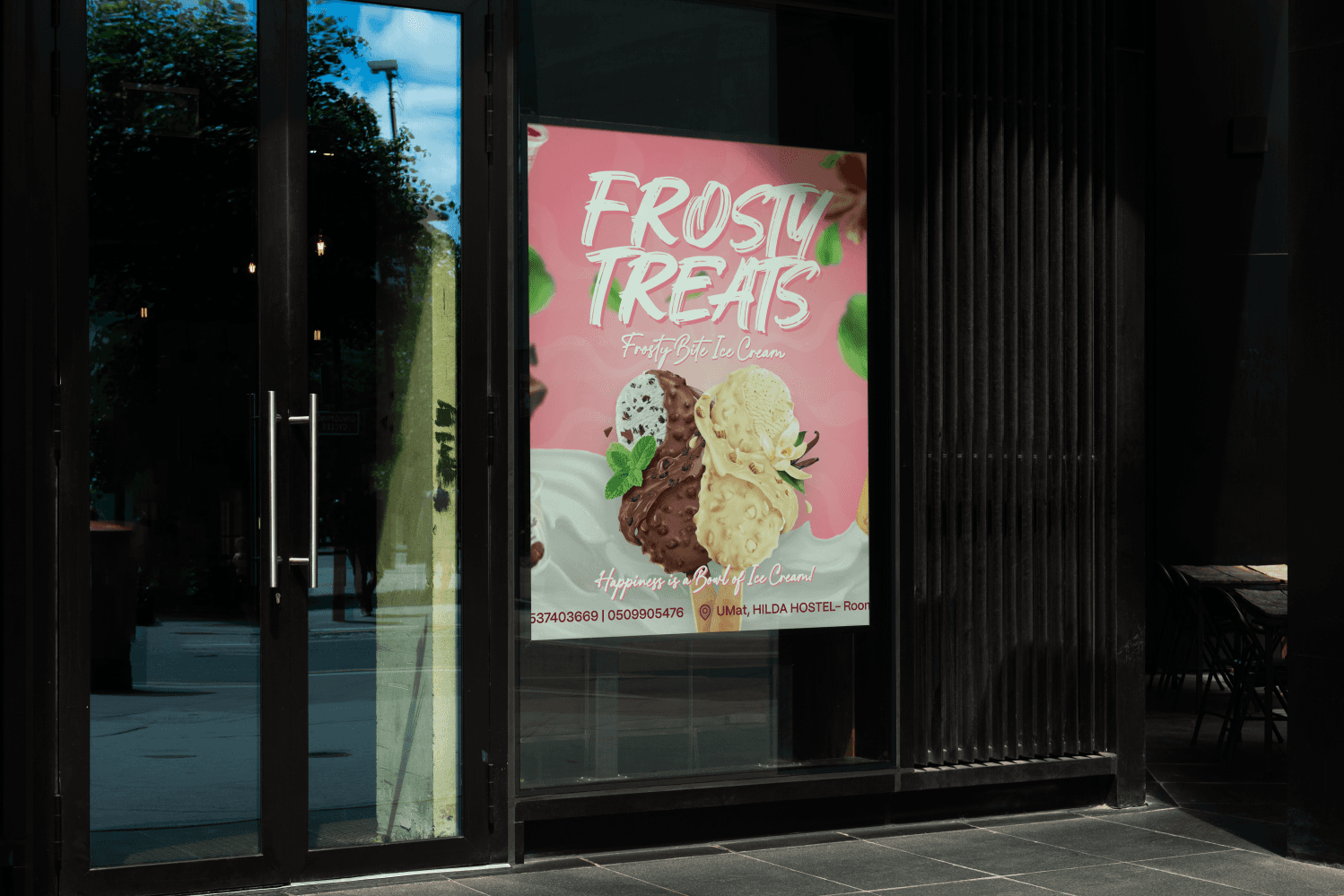
Frosty Treats Ice Cream Promotional Flyer
Deliverables
Ice Cream Promotional Flyer Design
Year
2023
Scope of Work
FLYER DESIGN
PHOTOSHOP
GRAPHIC DESIGN
BRAND IDENTITY
Project Overview
The Frosty Treats flyer needed to immediately capture attention and communicate the joy of ice cream. Existing promotional materials lacked visual energy and failed to establish a strong connection with the target market. My goal was to create a vibrant, irresistible visual asset. This asset must drive customer contact and clearly state the product offering and location.
My Role
As the solo designer, I managed the concept development and final production of this commercial asset.

Defining the energetic visual direction.
Selecting typography for impact and fun.
Integrating product photography for appetite appeal.
Ensuring clear placement of essential contact details.


The Problem
The previous marketing assets were visually muted and failed to convey the product's quality or emotional benefit. Customers did not immediately grasp the product type or how to place an order. The business needed a singular, high-impact image. This image must quickly solve the awareness problem and convert viewers into immediate customers.
Design Goals
I focused on building a compelling flyer that translates the product's taste and enjoyment into a visual format.
Achieving high appetite appeal.
Ensuring immediate clarity of product and offering.
Driving the user toward clear contact information.

Design Strategy
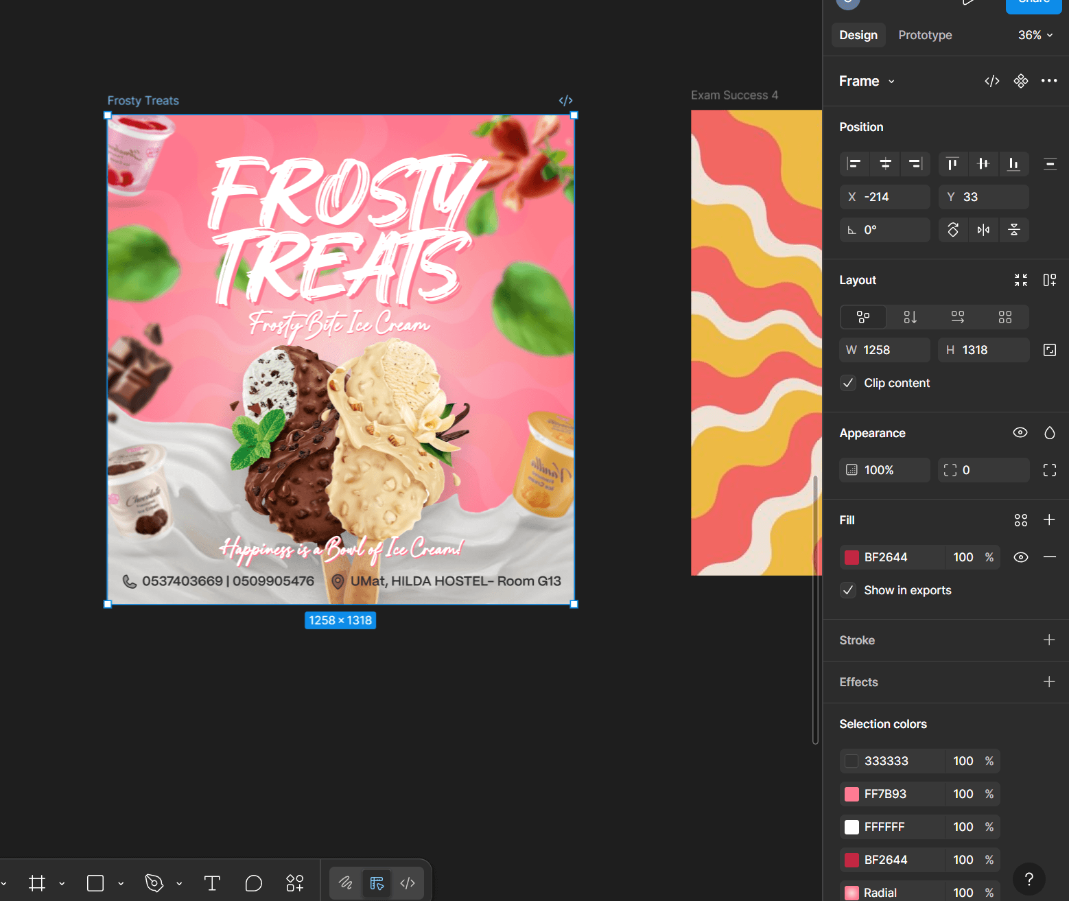
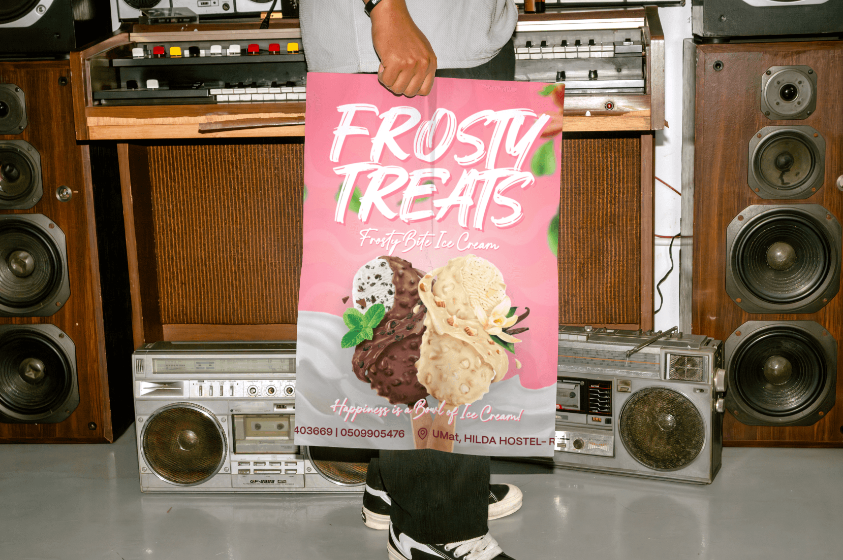
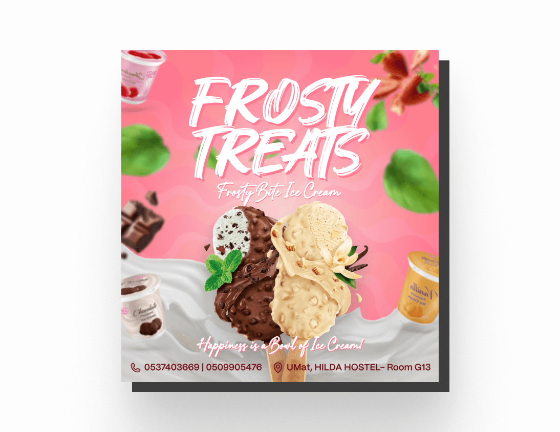
I used a dominant pink and white color palette. This strategy immediately evokes sweetness and fun. The central feature is high-resolution photography of the product in a dynamic milk splash. This drives appetite appeal. Bold, script typography establishes a friendly and energetic tone. The essential contact information is located at the bottom. This ensures a clear call-to-action path for the viewer.
Final Design
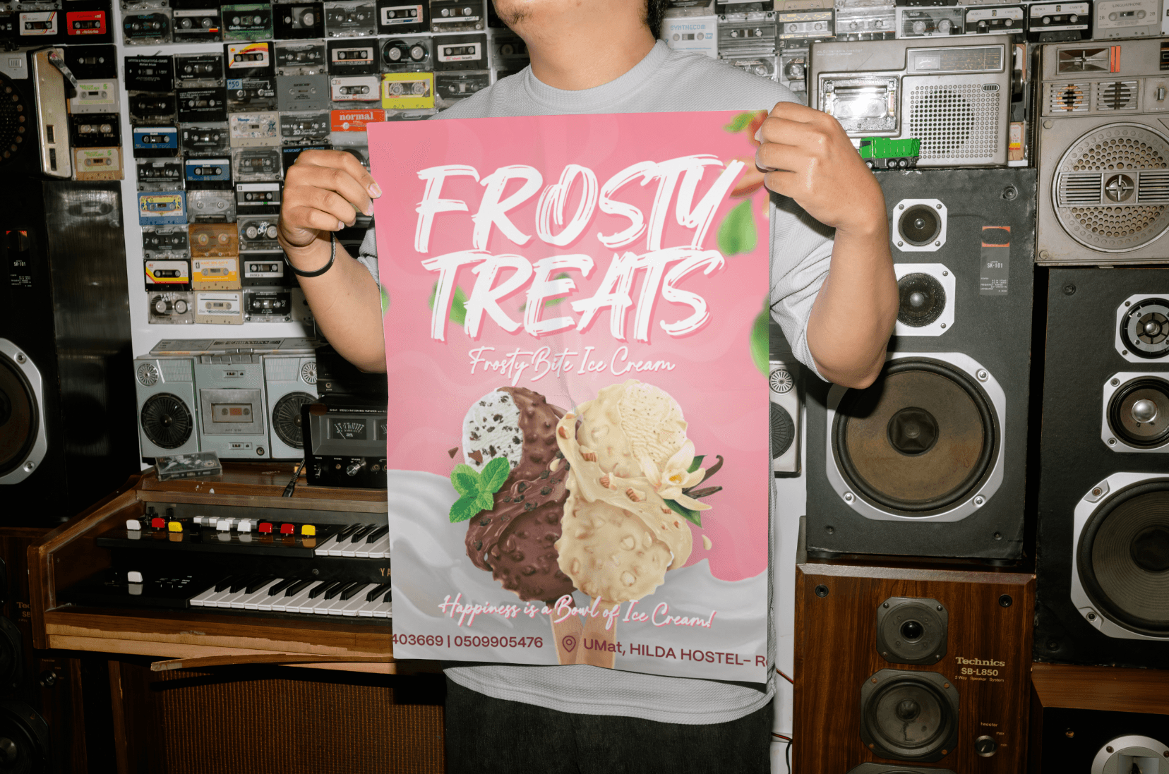
The final design achieves a polished, energetic, and highly appetizing look. The image immediately communicates 'ice cream' and 'treats'. The tagline, 'Happiness is a Bowl of Ice Cream!' reinforces the emotional benefit. All necessary ordering details are clear, highly visible, and positioned for conversion. The flyer is ready for instant digital deployment.
Challenges
I encountered specific challenges maximizing visual impact within a constrained digital space.
Balancing text density with visual flair.
Creating an appetizing look for frozen products.
Ensuring high contrast for all critical information.

Impact
The improved visuals provided the business with a stronger, more memorable marketing asset. This design directly supports seasonal promotional efforts.
Increased engagement due to strong visual appeal.
Clearer communication of product and ordering method.
Improved brand recall among the target audience.