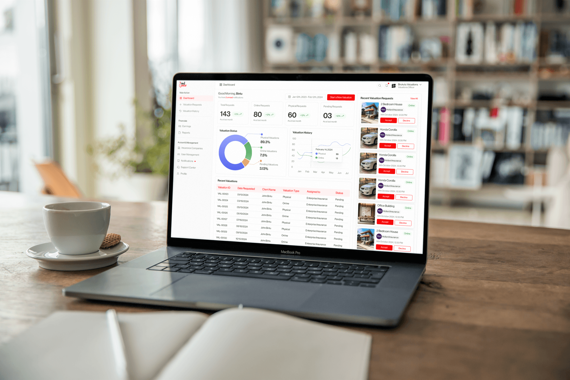
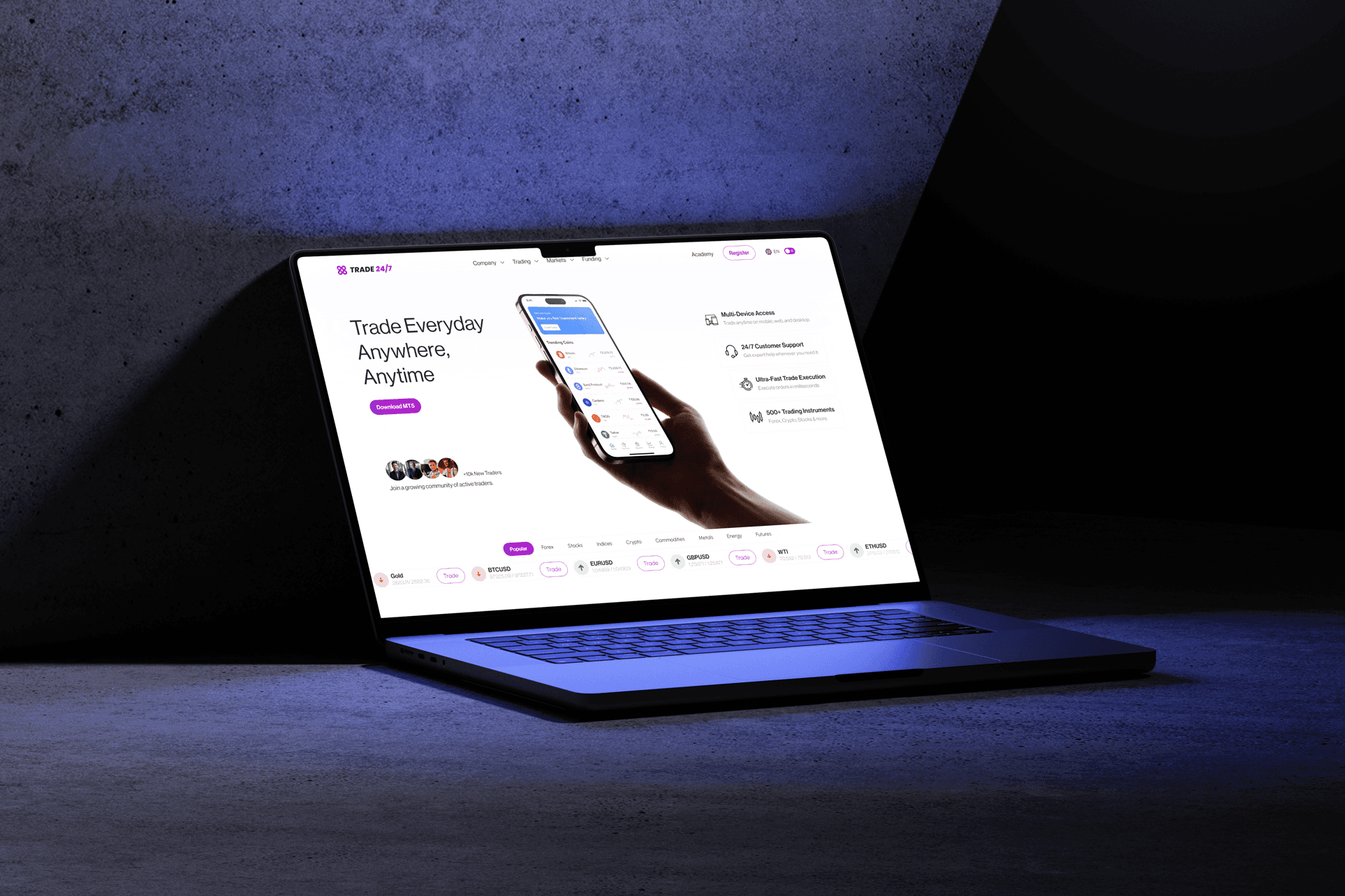
Oguaa Fetu Afayhe Festival Promotional Flyer
Deliverables
Ice Cream Promotional Flyer Design
Year
2023
Scope of Work
FLYER DESIGN
PHOTOSHOP
GRAPHIC DESIGN
BRAND IDENTITY
Project Overview
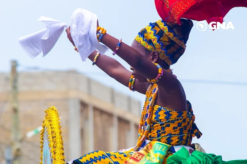
The Oguaa Fetu Afayhe Festival is a significant cultural event celebrated by the people of Oguaa (Cape Coast) in Ghana. The festival honors a past epidemic and thanks the gods for the harvest and peace. The promotional flyer needed to respect this heritage while communicating an energetic, contemporary celebration. My goal was to create a visually dense, celebratory asset that captures the spirit of the Fetu Afayhe and encourages attendance at the associated events.
My Role
As the solo designer, I managed the entire visual concept, research, and composition of this event poster.

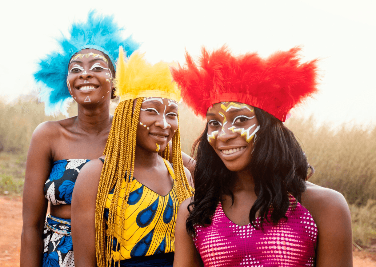
Researching and integrating relevant cultural motifs.
Selecting a color palette that signifies Ghanaian celebration and nature.
Composing high-impact typography for the festival name.
Structuring all critical event details for high visibility.

The Problem
Previous event materials often lacked the necessary visual energy and cultural depth required for a major festival. The core problem was capturing the event's complex meaning—a mix of solemn tradition and vibrant celebration—in a single, eye-catching format. The poster needed to instantly communicate the date, location, and the powerful cultural nature of the gathering
Design Goals
I focused on building a compelling flyer that translates the product's taste and enjoyment into a visual format.
Achieving high appetite appeal.
Ensuring immediate clarity of product and offering.
Driving the user toward clear contact information.

Design Strategy
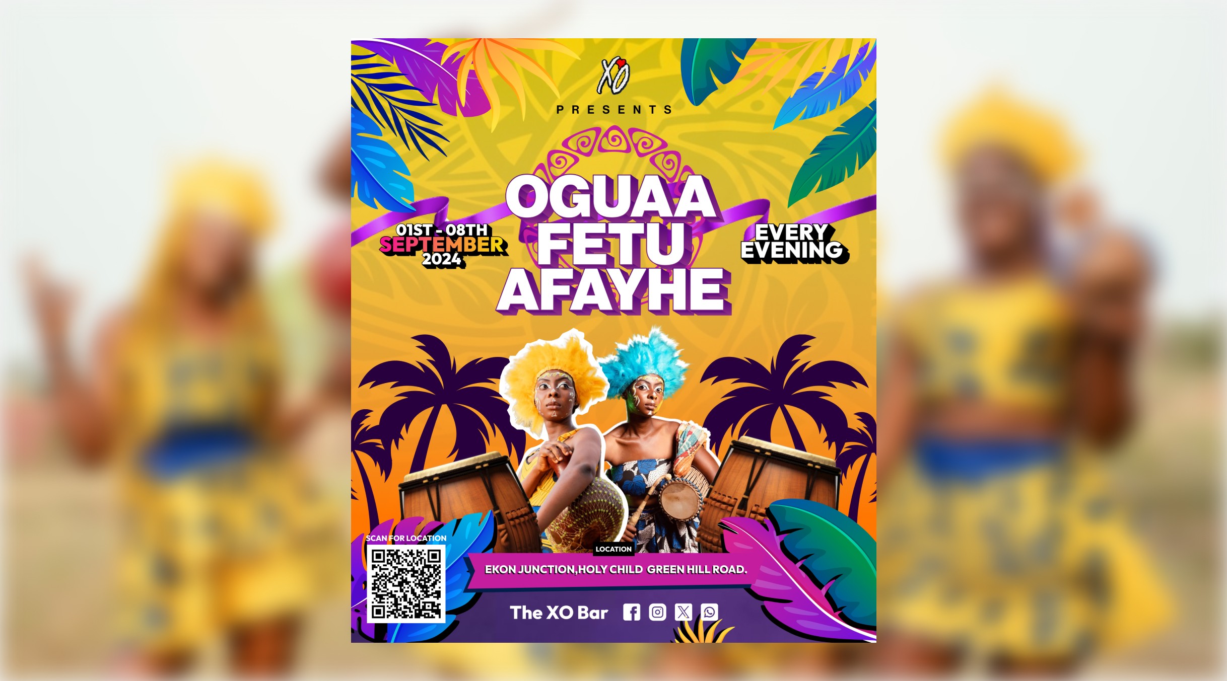
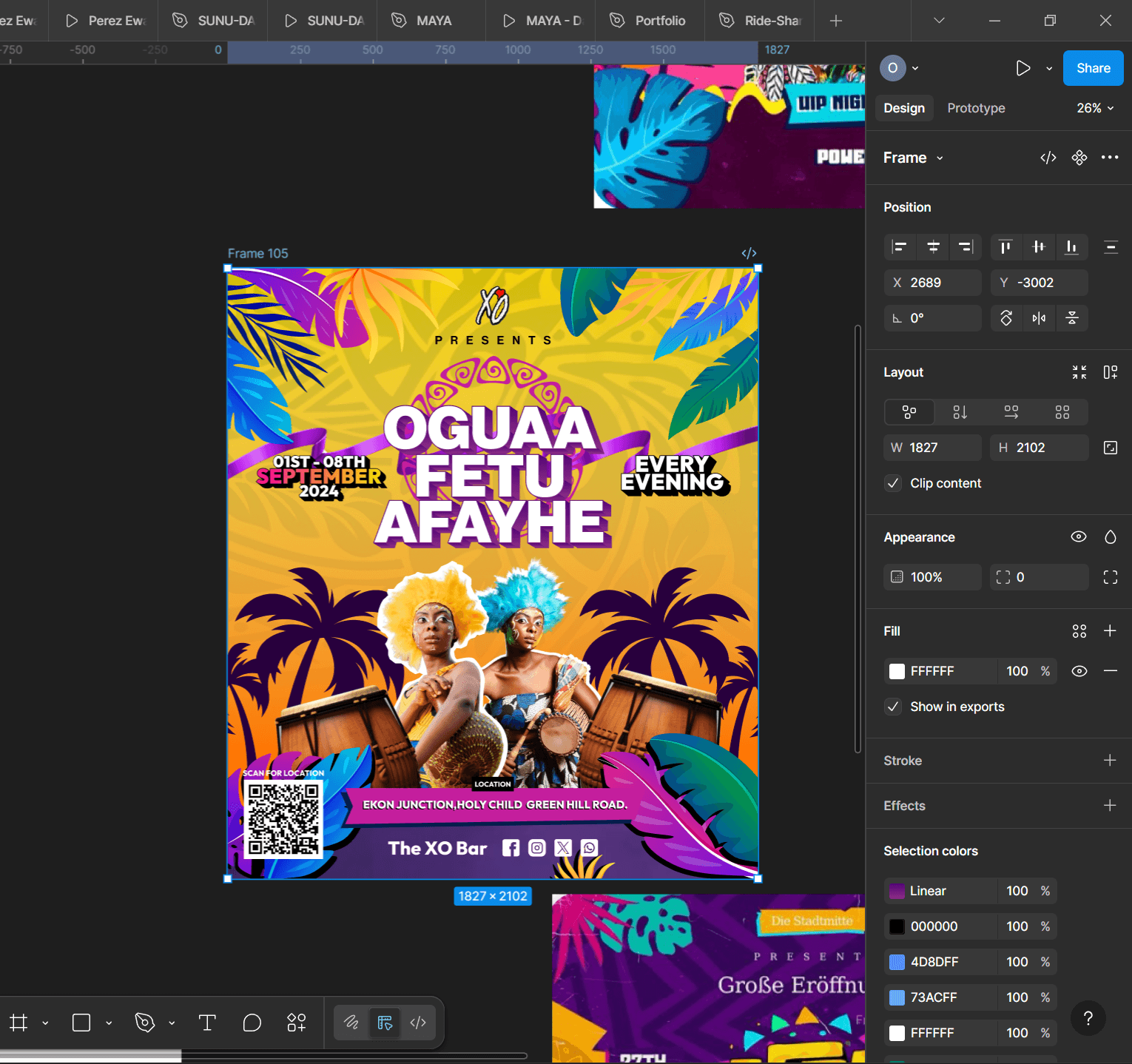
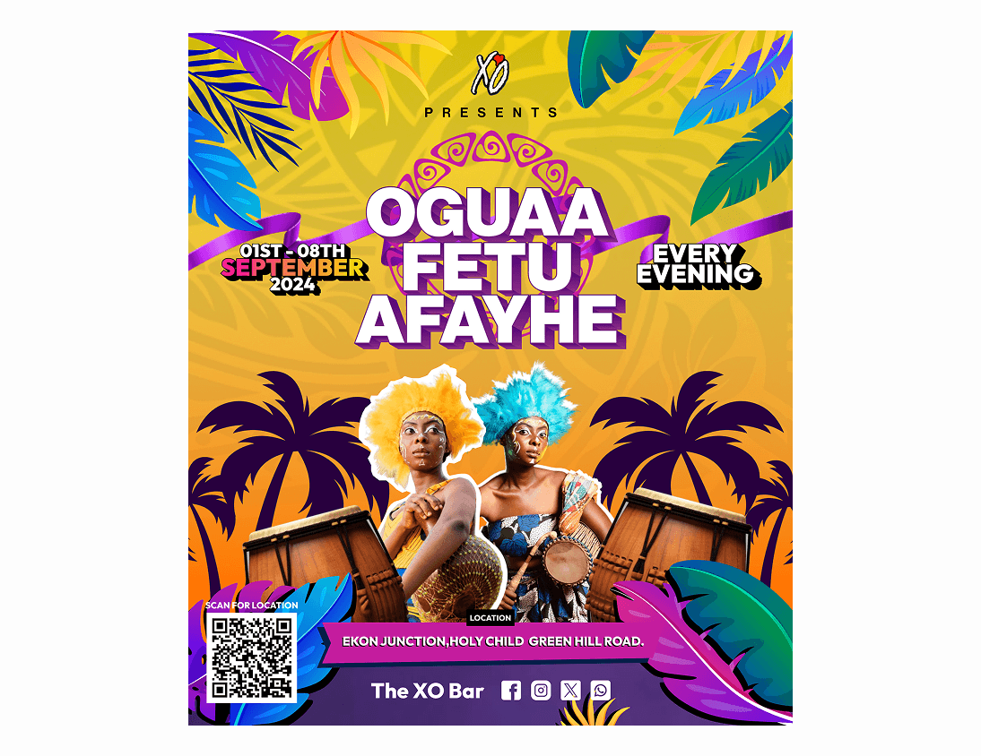
I used a dominant yellow and purple palette. Yellow signifies happiness and prosperity, crucial to a harvest festival. Purple and vibrant tropical greens reinforce the natural, ceremonial setting. The composition uses layering of foliage elements to create depth and frame the central figures. The bold, shadowed typography for 'OGUAA FETU AFAYHE' dominates the space. This ensures instant recognition, supporting the overall energetic and celebratory tone.
Final Design
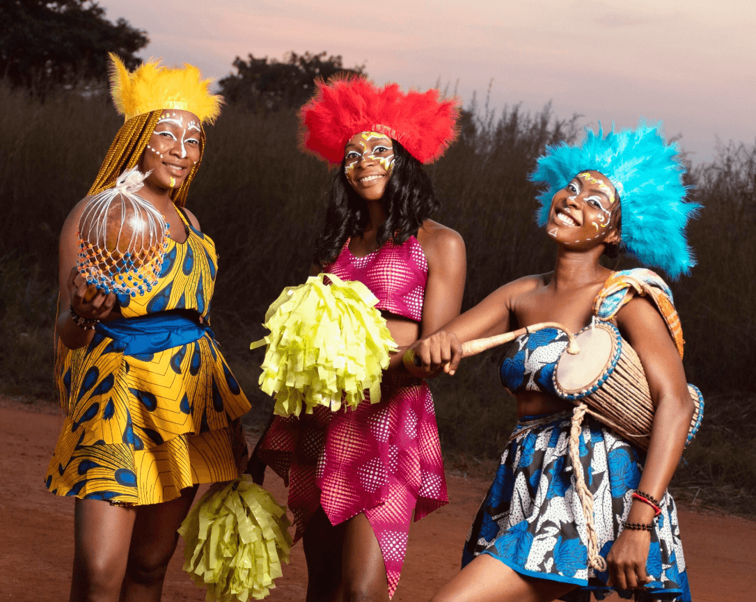
The final flyer presents a powerful, layered, and culturally resonant design. The central figures immediately ground the design in the festival's traditional spirit. All critical event information is clearly separated from the background visual elements. The overall look is dynamic, making the festival feel both authentic and highly anticipated.
Challenges
I faced key challenges integrating multiple layers of information and imagery into one cohesive composition.
Cultural Sensitivity and Accuracy.
Managing Visual Density.
Creating Depth in a Flat Medium.

Impact
The effective branding gave the event a distinctive, high-quality visual identity suitable for both local and international promotion.
Increased visual distinction from other local events.
Provided a versatile asset for cross-platform promotion.
Stronger communication of the event's cultural significance.